


Prediction markets are no longer niche crypto experiments. Monthly trading volume surged past $20 billion in early 2026, platforms like Polymarket and Kalshi are processing billions per month, and mainstream financial players — Robinhood, DraftKings, Coinbase — have all launched competing products. The market has found product-market fit. The question is no longer whether people want to trade on real-world outcomes, but how well you can design the experience.
And design is where most new prediction market products fail. Not just in layout or visual polish — but in the deeper interaction design that determines whether a user opens the app once or comes back every day. Prediction markets have yet to build the dopamine-driven engagement loops that casino apps, sports betting platforms, and mobile games have spent decades perfecting. The platforms that crack this — through XP systems, micro-interactions, loyalty rewards, and the kind of tactile, satisfying interface details that make every tap feel like something happened — will dominate the next phase of the market.
A prediction market is a platform where users buy and sell contracts based on the likelihood of future events, with prices reflecting the crowd’s consensus probability. That single sentence contains the core design challenge: you are asking everyday users to think probabilistically, interpret volatile financial data in real time, trust a platform with their money, navigate blockchain infrastructure they may not understand, and do all of this on a phone screen while an event is unfolding live.
This guide breaks down the UX/UI patterns that define the best prediction market interfaces in 2026. It is informed by our experience designing over 100 blockchain products at Avark — including real-time analytics dashboards, gamified engagement systems, crypto on-ramp experiences, and web3 sports betting interfaces — all of which share core UX challenges with prediction markets.
Why Prediction Markets Have Become the World’s Real-Time Truth Engine
To understand why the design of prediction markets matters so much, you first need to understand what prediction markets have become. They are no longer just trading platforms. They are emerging as the world’s most trusted real-time indicators of what is actually going to happen — in politics, economics, sports, geopolitics, and culture. And that shift fundamentally changes the design challenge.
The reason is deceptively simple: money talks. When people put real money behind a prediction, the resulting price signal is more honest than any poll, pundit, or social media consensus. A prediction market does not care about ideology, narrative, or wishful thinking — it aggregates the actual beliefs of people who have something to lose if they are wrong. During the 2024 US election, Polymarket’s probability estimates proved more accurate than virtually every major polling organisation. That was the moment prediction markets crossed over from crypto curiosity to mainstream information infrastructure.
The consequences of that crossover are now visible everywhere. In January 2026, Dow Jones announced an exclusive data partnership with Polymarket, embedding live market-implied probabilities directly into The Wall Street Journal, Barron’s, MarketWatch, and Investor’s Business Daily. For the first time, readers see live prediction odds alongside stock tickers — the collective consensus on Federal Reserve decisions, corporate earnings, and geopolitical outcomes treated as a primary financial indicator rather than a novelty.
Journalists now routinely cite Polymarket probabilities in breaking news coverage. Social media users screenshot prediction market odds and share them as shorthand for “what’s actually going to happen.” CNN and CNBC signed exclusive data deals with Kalshi. The Intercontinental Exchange — owner of the New York Stock Exchange — invested $2 billion in Polymarket. Prediction market data is replacing traditional polling as what industry commentators call the primary “truth signal” used by economists, strategists, and analysts.
This also means prediction markets attract people with genuine information advantages. When a user wagered $436,000 on the removal of Venezuelan President Maduro hours before a US military operation, or when over 300 bets exceeding $1,000 flooded Polymarket in the 24 hours before US strikes on Iran, those were not lucky guesses — they were signals from people who knew something. Congress has since begun advancing legislation to bar federal employees from trading on prediction markets, which itself validates the premise: the markets contain real information because participants have real skin in the game.
What this means for design:
This evolution from trading tool to information infrastructure changes the design challenge in concrete ways. The interface is not just serving traders — it is serving a growing audience of information consumers who will never place a trade but who rely on the platform’s data as a signal. Polymarket’s design choice to present markets as browsable content cards rather than trading terminals suddenly looks prescient: the platform’s biggest user base may not be traders at all, but the millions of people who check Polymarket the way they once checked polling aggregates.
For designers building new prediction markets, this means: probability displays must be instantly comprehensible to non-traders, embeddable widgets and shareable formats matter as distribution mechanisms, the line between “news platform” and “trading platform” is the core positioning decision, and the trust architecture of the interface has implications beyond user retention — it affects whether journalists, analysts, and institutions treat your platform as a credible signal source.
Why Prediction Market UX Is Uniquely Hard
Before getting into patterns, it is worth understanding why prediction markets present design challenges that standard fintech or Web3 interfaces do not.
Users must think probabilistically. Most people do not naturally reason about probability. A contract priced at $0.72 means the market assigns a 72% chance to an outcome — but that framing is unintuitive. Users confuse probability with certainty, misinterpret price movement as momentum rather than information updating, and struggle with the concept that a “losing” position still had positive expected value. Every design decision — from how prices are displayed to how charts are labelled — either helps or hinders probabilistic reasoning.
The interface is the trust layer. In a prediction market, users are depositing funds, making decisions with monetary consequences, and trusting that outcomes will be resolved fairly. Unlike a social media feed where a bad UX is merely annoying, a confusing prediction market interface directly costs users money. Resolution criteria must be crystal clear. Settlement mechanics must be transparent. Error states during transactions must be handled gracefully. The interface is not a wrapper around backend logic — it is the product.
Time pressure is constant. Prediction markets are event-driven. Contract prices move in real time as news breaks, games progress, and data is released. Users need to assess information, evaluate probability, and execute trades quickly. Every extra tap, every ambiguous label, every slow-loading element is friction that can cost a user money or cause them to abandon the platform.
The audience spans beginners to institutional traders. A single prediction market platform may serve first-time users who heard about event contracts on social media and professional traders running multi-position portfolios. The interface needs to accommodate both without alienating either — a challenge that requires careful use of progressive disclosure, layered information architecture, and role-aware design systems.
Regulatory compliance is a design problem. KYC/AML flows, jurisdictional gating, risk disclosures, and geo-restrictions are not backend-only concerns. They are onboarding UX problems that directly impact conversion rates. A badly designed KYC flow can kill 40-60% of signups. A well-designed one — tiered, contextual, and woven into the product experience — satisfies regulators while keeping users moving.
Learning from the Top 3: Polymarket, Kalshi, Robinhood
The three dominant prediction market interfaces in 2026 each represent a distinct design philosophy. Understanding what each does well — and where each compromises — is essential before designing your own.
Polymarket: The Content-First Trading Interface
Polymarket is built on Polygon but its design philosophy is to make that fact invisible. The interface resembles a social media feed more than a trading terminal — and that is entirely deliberate. 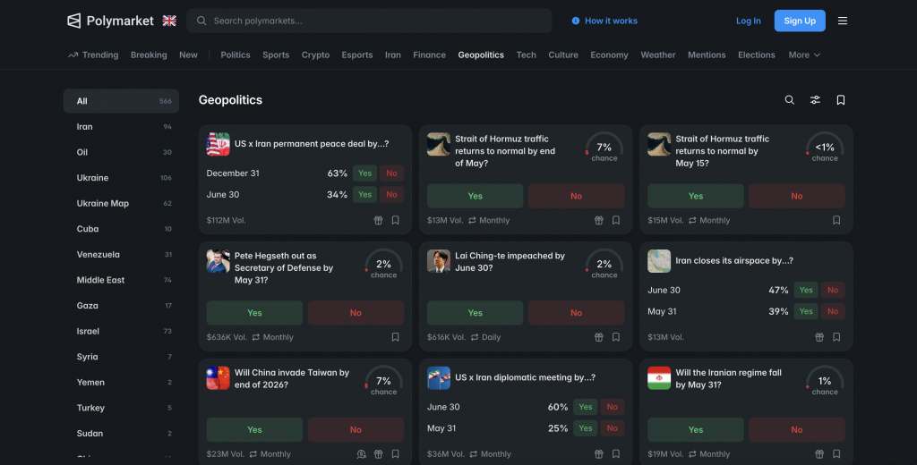
What works:
The market card is the core navigation unit. Each event is an interactive card showing a prominent probability percentage, colour-coded outcome indicators, and a thumbnail image that gives visual context. This card-based pattern makes market discovery feel like scrolling a news feed rather than navigating an order book. It is the single most important design decision Polymarket has made, because it reframes prediction markets from “complex financial trading” to “engaging with the news.”
The onboarding uses embedded wallets and account abstraction to eliminate seed phrase management. New users never see a wallet address, never manage gas fees, never interact with blockchain infrastructure directly. The crypto is invisible. This is what we call the “invisible Web3” pattern — one we’ve applied across projects like finestt (DeFi wallet simplification) and Transak (crypto on-ramp UX).
The data visualisation favours clarity over density. Probability timelines use clean line graphs with colour-coded outcomes rather than candlestick patterns. There are no depth charts, no volume histograms, no technical indicators. Polymarket treats users as information consumers first, traders second.
What it sacrifices:
Power users and active traders find the interface lacking. There is limited order book visibility, no contract volume data in the browsing view, and thin portfolio management tools. The card-based discovery pattern, while excellent for onboarding, does not support the kind of multi-market monitoring that professional traders need. If your target audience includes serious traders, Polymarket’s pattern alone is insufficient.
Perhaps more importantly, Polymarket has not invested in the engagement layer between trades. The experience of placing a trade is functional but emotionally flat — there is no satisfying confirmation animation, no XP reward, no streak mechanic, no reason to open the app on a quiet Tuesday when no major event is unfolding. The platform relies entirely on event-driven engagement, which creates the boom-bust retention pattern that is prediction markets’ biggest unsolved design problem.
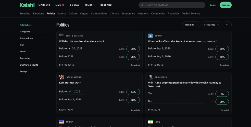
Kalshi: Trust Through Visible Regulation
Kalshi takes the opposite approach. Its design language borrows from traditional brokerage platforms — organised categories, prominently displayed contract specifications, and a professional aesthetic that signals institutional credibility.
What works:
Kalshi makes regulation visible as a trust pattern. The CFTC designation is not buried in a footer — it is woven into the product experience. The KYC onboarding flow is conventional (sign up, verify identity, deposit funds via bank transfer), and for users familiar with opening a brokerage account, this familiarity itself builds trust. This is a counterintuitive design insight that many Web3 projects miss: in regulated financial products, compliance friction can build trust rather than erode it, provided the design communicates why the friction exists.
Market browsing is category-driven and taxonomically organised — politics, economics, sports, technology, weather, crypto — with contract details including settlement rules, expiry dates, and fee structures presented prominently. The information architecture assumes users arrive with intent to trade a specific category, not to browse and discover.
The trading interface prioritises data density. Order books, depth charts, and full contract specifications are accessible without drilling through multiple views. Kalshi provides what reviewers describe as unmatched granularity, with markets available on topics as specific as the exact number of times a word is said in a Federal Reserve meeting.
What it sacrifices:
The learning curve is steep. First-time users face a KYC speed bump before they can explore the product, and the exchange-like aesthetic can feel intimidating. The mobile experience is responsive but desktop-first in its information hierarchy. Kalshi’s design works exceptionally well for its target audience (serious, US-based event traders) but would not work for a platform targeting mainstream, mobile-first consumers.
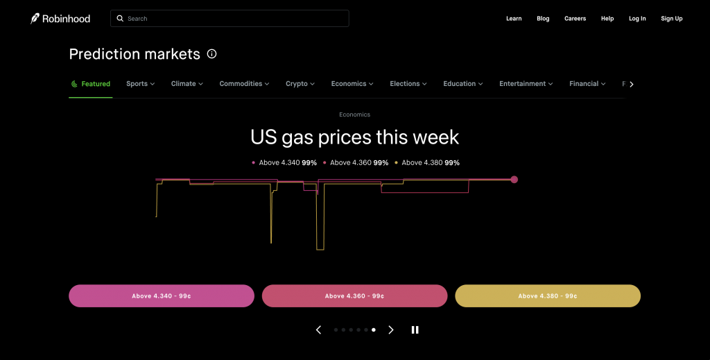
Robinhood: Prediction Markets as a Feature, Not a Product
Robinhood’s prediction markets represent the third paradigm: event contracts embedded within a broader financial super-app rather than built as a standalone product.
What works:
The radical simplification. Robinhood strips away everything that makes prediction markets feel complex: no visible order book, no depth charts, no contract volume data. Contracts are presented identically to buying a stock — pick an event, choose Yes or No, see the price (which represents the market’s implied probability), and trade. A contract at $0.75 means 75% implied probability. If correct, it pays out $1.
Because prediction markets sit inside the existing Robinhood brokerage app, the onboarding problem essentially disappears for existing users. KYC is already complete. Bank connections already exist. The user can discover prediction markets and place their first trade within seconds. No other platform can match this first-trade conversion speed for its existing user base.
The mobile-first interface uses the same minimalist dark-background aesthetic, same navigation patterns, and same interaction language as the rest of the app. Categories are browsable through a horizontal scroll (Featured, Sports, Crypto, Economics, Politics, Climate, Technology, Entertainment) with animated probability counters that update in real time. The consistency with Robinhood’s existing design system means users do not need to learn a new interface vocabulary.
Robinhood is also the only major prediction market that has invested meaningfully in micro-interactions. The animated probability counters — numbers that visually roll from one value to another — are a small detail that makes the interface feel alive. The smooth transitions when switching between categories, the haptic tap when confirming a trade, and the clean visual feedback on position updates all create a tactile experience that Polymarket and Kalshi largely lack. These 200-400ms interaction details seem minor individually, but collectively they are the difference between an interface that feels like a spreadsheet and one that feels like a product people enjoy using.
What it sacrifices:
Transparency and depth. Robinhood deliberately hides the trading infrastructure that sophisticated users rely on: there is no bid-ask spread visibility, no contract volume, no way to assess market depth. For users who want to understand the mechanics of the market rather than simply participate, the interface provides too little information. The platform has faced criticism for this opacity, with reviewers noting you cannot see who is on the other side of your trade or how liquid a market truly is.
This is the fundamental tension for new platform designers: Robinhood proves that extreme simplification drives massive adoption, but the cost is that users are making financial decisions with less information than they would have on any other prediction market.
What New Platforms Should Take from Each
Each platform reveals a design tension that new products must resolve. Polymarket demonstrates that crypto complexity can be fully abstracted — but at the cost of trading depth and engagement mechanics. Kalshi proves that visible regulation is a trust pattern, not just a compliance burden — but at the cost of onboarding speed. Robinhood shows that embedding prediction markets in a familiar financial app dramatically lowers the barrier to entry — but at the cost of transparency and analytical depth.
Critically, all three share the same gap. None of them have built the engagement layer — the XP systems, streak mechanics, micro-interaction polish, and daily reward loops — that turns event-driven usage into habitual daily engagement. The platform that combines the best of these three with a genuine gamification and retention layer will own the next phase of this market.
Core Design Principles for Prediction Markets
Drawing from these platform examples and our work across 100+ blockchain products, these are the principles that should guide every prediction market design decision.
1. Design for Probabilistic Clarity, Not Data Dump
The single most important job of a prediction market interface is to make probability intuitive. This means:
Use natural language alongside numerical prices. “$0.72” means nothing to most users. “72% chance” is immediately understandable. The best interfaces show both, with the natural language framing dominant and the cent-based price secondary. Robinhood does this well by labelling contracts at “72¢” while making clear this represents probability.
Choose chart types that communicate uncertainty, not just price history. Probability timeline charts (like Polymarket’s clean line graphs) communicate the evolving consensus on an event. Candlestick charts communicate trading patterns. These are different things, and your audience determines which matters more. For consumer-facing platforms, probability timelines are almost always the better choice.
Make resolution criteria prominent, not buried. How an event resolves — what counts as “yes,” what the source of truth is, what happens in edge cases — is the most important information on any market page. If users do not trust that resolution will be fair and transparent, nothing else in the interface matters. Give resolution criteria a dedicated, prominent section above the fold.
2. Abstract Complexity Progressively
Progressive disclosure — showing basic information upfront and revealing complexity as users need it — is the defining interaction pattern for prediction markets that serve multiple audience types.
The default view should serve the largest audience. For most platforms, that means a simplified interface showing the event, the probability, and a clear action (buy Yes/No). Advanced features — order book, price history, contract specifications, portfolio analytics — should be one interaction away, not absent but not competing for attention.
This is the pattern we have applied extensively in our product design work across DeFi and fintech projects. The Transak on-ramp, for example, needed to serve complete crypto beginners and experienced traders within the same interface. The solution was a layered experience where the default flow was extremely simple, with advanced options (network selection, gas customisation, alternative payment methods) accessible but not overwhelming.
For prediction markets, progressive disclosure typically manifests as:
Layer 1 (everyone): Event card with probability, binary Yes/No action, clear outcome description. Layer 2 (engaged users): Probability chart, recent trade history, resolution criteria, position sizing. Layer 3 (power users): Full order book, depth chart, contract specifications, portfolio correlation tools, export capabilities.
3. Make Trust Visible, Not Assumed
Prediction markets have a trust problem that most fintech products do not: users must trust that outcomes will be resolved fairly by a decentralised oracle, a centralised team, or a regulatory body. And they must trust this before depositing money.
Trust patterns that work in prediction markets include:
Visible resolution sources — showing exactly which data source or oracle will determine the outcome, linked to an external verification point where possible.
Settlement transparency — making it clear when and how payouts happen after resolution, including any dispute mechanisms.
Regulatory signalling — if your platform operates under regulatory oversight (CFTC, MiCA, etc.), make this visible throughout the experience, not just in the footer. Kalshi demonstrates that regulation-as-trust-signal is a legitimate design pattern.
Social proof and market depth indicators — showing trading volume, number of participants, and open interest helps users assess whether a market is liquid and legitimate. Robinhood’s decision to hide this data, while simplifying the interface, removes a trust signal that many users rely on.
Audit trails — for blockchain-based platforms, showing on-chain settlement records, oracle transaction histories, and smart contract verification links provides verifiable trust rather than claimed trust.
4. Design the Onboarding Funnel as the Product
In prediction markets, the onboarding flow is not a step users complete before using the product — it is the first product experience that determines whether they ever use the product at all.
The three platforms illustrate three distinct approaches: Polymarket abstracts crypto entirely with embedded wallets. Kalshi uses traditional financial onboarding (KYC → bank deposit → trade). Robinhood bypasses onboarding altogether by embedding prediction markets into an existing authenticated experience.
For new platforms, the key decisions are:
How much identity verification is required before a user can explore the product? The best approach is to let users browse markets, see prices, and understand the product before requiring any signup — then gate the actual trading action behind verification. This “explore before committing” pattern significantly improves conversion because users already understand the value proposition before hitting friction.
How many steps to first trade? Every step between “I want to try this” and “I have placed my first trade” is a drop-off point. Map this funnel, measure every step, and treat reduction of this funnel as a core design KPI.
We have written extensively about blockchain onboarding UX patterns, and the principles apply directly: reduce wallet complexity, defer identity verification where legally possible, use familiar payment patterns, and provide immediate feedback on every action.
5. Design for Mobile as the Primary Experience
Polymarket’s mobile-first approach drove it to the top of App Store rankings. Robinhood’s prediction markets exist only within a mobile app. The data is clear: the majority of prediction market participation — especially for sports, politics, and breaking news events — happens on phones.
This has specific design implications:
Information hierarchy must be ruthlessly prioritised for small screens. On desktop, you can show a probability chart, order book, and resolution criteria simultaneously. On mobile, you need to decide what the user sees first and what requires a scroll or tab.
Trade placement must be optimised for thumb-zone interaction. The Yes/No buttons, price input, and confirmation action should be reachable with a single thumb on standard phone sizes. Time-sensitive trades (a contract during a live sporting event, for example) cannot afford clumsy interaction patterns.
Real-time updates must be visually clear without being noisy. Animated probability counters (like Robinhood’s rolling number displays) communicate live data effectively. Flashing price changes or aggressive colour shifts create anxiety. The animation language should communicate “this is live” without communicating “this is urgent and scary.”
Push notifications become a core retention mechanism. Prediction markets are event-driven, and the ability to bring users back to the platform at the right moment (event starting, odds shifting, position at risk) is a significant design lever. But notification fatigue is real — the design must give users granular control over what triggers alerts.
Key UX/UI Patterns for Prediction Markets
With principles established, these are the specific patterns that the best prediction market interfaces use in 2026.
Market Discovery: Card-Based Browsing
The market card has become the standard unit of prediction market navigation, pioneered by Polymarket and adopted in various forms by most competitors. An effective market card contains: a clear event description, a prominent probability indicator, a visual element (team logos, event thumbnails, category icons), volume or participation indicators, and a time-remaining signal for expiring markets.
The card-based pattern works because it allows horizontal or vertical scrolling through diverse market categories while maintaining a consistent information structure. Users learn to read a market card once and can then navigate any category.
Design consideration: cards must degrade gracefully across screen sizes. A card that looks clean on desktop with a thumbnail, probability chart, and trade button becomes cluttered on mobile. The mobile version should show the event, probability, and a single action — nothing more.
Probability Display: Dual-Format Communication
The most effective pattern is to show probability in two formats simultaneously: a cent-based price (for users who understand contract mechanics) and a percentage (for everyone else). Robinhood leads here with its “72¢” display, which implicitly communicates both price and probability. Polymarket uses explicit percentages alongside price charts.
For multi-outcome markets (e.g., “Who will win the next election?” with 5+ candidates), the display challenge intensifies. A horizontal bar showing proportional probability for each outcome, colour-coded by candidate or team, is the emerging standard. Interactive hover or tap states should reveal the exact percentage and contract price for each outcome.
Onboarding: The Tiered Identity Pattern
For regulated platforms, the tiered KYC pattern balances compliance with conversion:
Tier 0 (no verification): Browse markets, view prices, read resolution criteria, explore the product. No signup required. Tier 1 (email/phone): Create an account, set up a watchlist, receive notifications. Light verification. Tier 2 (basic KYC): Trade with low position limits. Name, date of birth, basic identity check. Tier 3 (full KYC): Unlock higher limits, withdrawals, and advanced features. Document verification, address proof.
This tiered approach lets users experience value at each level before the next friction point. It is the same principle we applied in the Transak on-ramp redesign — where the challenge was onboarding users from fiat to crypto across 155+ countries with varying regulatory requirements.
Real-Time Data: Streaming Without Anxiety
Prediction market data updates constantly, and the interface must reflect this without creating visual chaos. The key patterns are:
Smooth number transitions rather than sudden jumps. When a probability changes from 72% to 74%, animate the transition over 200-300ms. Sudden number changes feel jarring and trigger anxiety. This is one of the most impactful micro-interactions in the entire product — a probability display that rolls smoothly from one value to another communicates “this market is alive and updating” without the stress of numbers jumping unpredictably. Robinhood’s animated probability counters are the current benchmark here, and the pattern should be standard across every prediction market interface.
Colour-coded directional indicators. Green for probability increasing, red for decreasing — but used sparingly and desaturated to avoid the “stock ticker anxiety” that comes from aggressive red/green flashing. Subtle directional arrows or small “+2%” badges next to the probability number can convey movement without turning the interface into a wall of flashing indicators.
Timestamp relevance. For fast-moving markets (live sports, breaking news), showing the time of the last price update builds trust. Users need to know they are seeing current information, not a cached state. A small “Updated 3s ago” label, pulsing gently on each refresh, is a micro-interaction that communicates liveness without demanding attention.
Notification-driven re-engagement. For markets a user holds a position in, push notifications on significant probability shifts (>5% movement, for example) bring them back to the platform at the moment their engagement is highest. This is where the real-time data layer connects directly to the retention problem — a well-timed notification that says “Your position on [event] just moved from 65% to 72%” is a dopamine trigger that brings users back into the app naturally, creating a re-engagement loop that does not depend on a major event being live.
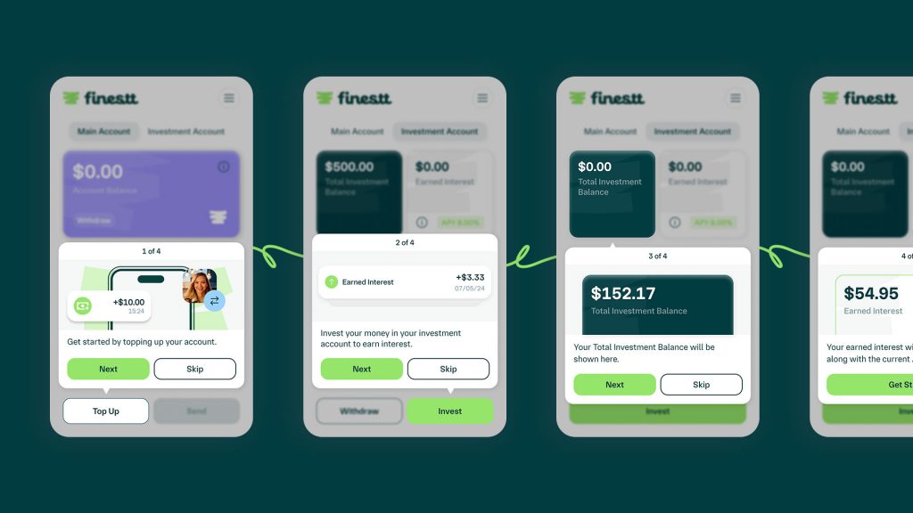
Wallet and Transaction UX: Invisible Blockchain
For Web3-native prediction markets, the wallet connection, transaction signing, and settlement flow is where most user friction lives. The emerging best practice is what we call “invisible Web3” — the blockchain infrastructure powering the product is entirely hidden from the end user.
This means: embedded wallets created automatically during signup (no seed phrase management), gas fees abstracted or sponsored, transaction signing handled silently via session keys, and settlement status communicated in plain language (“Your payout of $47.00 is on its way”) rather than blockchain jargon (“Transaction confirmed on block 18,492,731”).
We have written about these wallet UX patterns in detail in our blockchain UX design guide, and they apply directly to prediction markets. The DeFi wallet work we did on finestt was built around this exact principle — making blockchain interaction feel as simple as a standard fintech app.
Gamification: The Untapped Dopamine Layer
This deserves more than a subsection — it deserves a rethinking. Prediction markets have, so far, barely scratched the surface of gamification. The current state of the art is essentially: place a trade, wait for resolution, collect payout. That is a fundamentally passive experience between the moment of placing a bet and the moment of outcome. Compare that to the relentless engagement loops of casino games, sports betting apps, or mobile gaming — industries that have spent decades engineering dopamine-driven experiences that bring users back every single day.
Prediction markets have not yet evolved into these kinds of habit-forming experiences. And while that restraint is partly appropriate (these are financial products, not slot machines), there is an enormous design opportunity in the space between “sterile trading terminal” and “irresponsible gambling UI.” The platforms that find the right balance will dominate user retention.
Why daily engagement is the design problem prediction markets haven’t solved
The fundamental retention challenge is that most prediction markets are event-driven. Users arrive when something interesting is happening — an election, a big game, a Federal Reserve decision — and leave when it resolves. The platform has no natural reason to bring users back tomorrow if no major event is unfolding. This creates a boom-bust engagement pattern that makes it extremely difficult to build a sustainable business.
Casino and sports betting apps solved this problem decades ago through layered gamification: daily login rewards, streak mechanics, loyalty tiers, achievement systems, and social competition structures that create reasons to return independent of any single event. Prediction markets need their own version of this — one that respects the financial nature of the product while building habitual engagement.
The XP and loyalty system model
The most promising pattern for prediction market retention is an XP (experience point) system that rewards daily engagement with tangible value — not just badges, but real-world rewards that give users a concrete reason to come back every day.
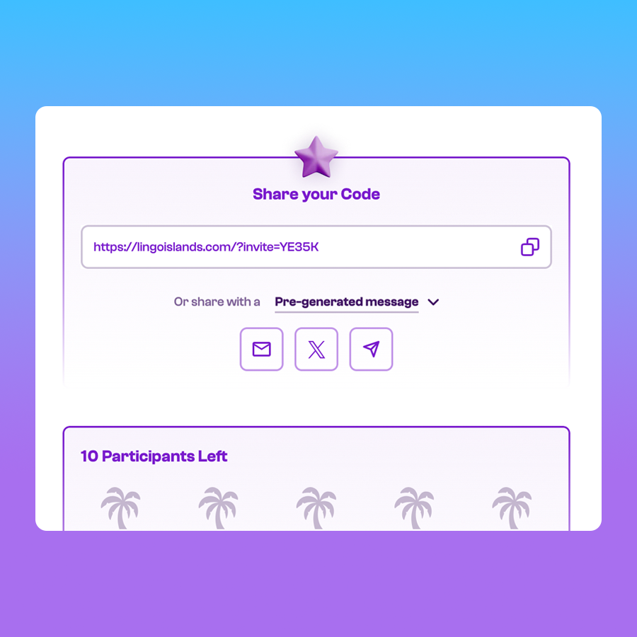
This is exactly what we designed and built for Lingo Islands, and it is the closest existing model to what prediction markets should be doing.
Lingo needed to solve a problem that prediction markets share: how do you build a community of engaged users who show up every day, not just when a major event is happening? The answer was a gamified SocialFi experience built around an XP system that rewarded multiple types of engagement — daily logins, social sharing, completing tasks, referring friends — with points that accumulated toward real-world rewards. Not abstract “governance tokens.” Actual rewards: hotel stays, Netflix subscriptions, Nike trainers.

The results speak to the power of this model: 600,000+ engaged community members, 10 million+ community tweets, 150,000 verified email subscribers in the first two weeks, and 5,500+ investors on the pre-public sale. That level of daily engagement did not come from the trading mechanic alone — it came from the gamification layer wrapped around it.
How to apply this to prediction markets:
A prediction market XP system could work as follows:
Daily participation rewards — Users earn XP for logging in, browsing markets, and checking their positions. This costs the platform nothing but creates a daily habit. The first login each day could surface a “Daily Market Digest” — a curated set of interesting markets the user hasn’t seen yet — combining content discovery with the XP trigger.
Accuracy-based XP — Rather than rewarding volume (which encourages reckless betting), reward calibration. Users who consistently predict with accuracy close to actual outcomes earn more XP than users who simply bet frequently. This creates a game-within-the-game where the goal is not “win more” but “be more right” — a meaningful distinction that aligns user incentives with platform quality.
Social engagement multipliers — Sharing predictions, commenting on market reasoning, and inviting friends all generate XP. This is the mechanic that made Lingo Islands so viral — the SocialFi layer turned private engagement into public brand momentum. For prediction markets, a user who shares their prediction on Twitter/X with a market link is doing marketing for the platform. Reward that.
Streak mechanics — Consecutive daily login streaks with escalating rewards create loss aversion in a positive direction: users do not want to break their streak. This is the mechanic that keeps Duolingo users opening the app every morning and Snapchat users maintaining their streaks. Applied to prediction markets, it creates a daily touchpoint independent of any event calendar.
Tiered loyalty with real-world rewards — XP accumulates into loyalty tiers (Bronze → Silver → Gold → Platinum), and each tier unlocks tangible benefits: reduced fees, early access to new markets, exclusive analytics tools, and at the top tiers, real-world rewards — merchandise, experiences, partner brand credits. The Lingo model proved that real-world reward redemption creates emotional investment that abstract points never can.
The critical design constraint: All of these mechanics must be presented as engagement and learning rewards, never as incentives to trade more or take bigger positions. The line between “rewarding participation” and “encouraging gambling” is a regulatory and ethical boundary that the design must respect. Accuracy-based XP and learning-oriented rewards (e.g., XP for completing a market analysis, reading resolution criteria, or reviewing past predictions) keep the gamification aligned with healthy user behaviour.
Micro-Interactions: The Detail That Creates Dopamine
Beyond systemic gamification, prediction markets are dramatically underinvesting in the micro-interaction layer — the small, tactile design details that make every action feel satisfying.
Consider what happens when you place a trade on most prediction market platforms today: you tap a button, see a loading spinner, and get a confirmation message. That is functionally correct and emotionally dead. Now consider what happens when you “like” a tweet, complete a level in a mobile game, or receive a notification on a casino app: there is haptic feedback, a satisfying animation, a sound cue, a visual flourish that makes the action feel real and rewarding.
Prediction markets need this layer of micro-interaction polish. Specifically:
Trade confirmation animations — When a user places a trade, the confirmation should feel like something happened. A subtle card flip, a satisfying checkmark animation, a brief confetti burst for their first trade, a portfolio value counter that ticks up. These 200-400ms animations cost almost nothing to implement but transform the emotional quality of the experience.
Probability shift animations — When a market’s probability moves, the transition should be smooth and directional. Numbers should roll rather than snap. Colour should shift gradually. The chart line should extend with a gentle ease-in. These micro-animations communicate “this market is alive” without the anxiety of aggressive flashing indicators.
XP gain feedback — Every XP-earning action should produce immediate, visible feedback: a small “+10 XP” toast notification, a progress bar that nudges forward, a tier indicator that pulses. This creates a Pavlovian loop where every platform interaction — even passive browsing — produces a small reward signal.

Position outcome celebrations — When a market resolves in the user’s favour, the moment should feel like a win. Not in a casino-jackpot way, but in a way that acknowledges the user was right. A clean animation showing the payout, a subtle sound, a “You predicted correctly” message with their accuracy stats updated. For inaccurate predictions, the tone should be neutral and learning-oriented: “The market resolved at 83%. Your prediction was 65%. Here’s what moved the odds.”
Haptic feedback on mobile — For mobile-first platforms, haptic responses on trade placement, position updates, and notification interactions make every touch feel deliberate and responsive. Apple and Android both provide nuanced haptic APIs that allow for subtle taps, confirmation pulses, and attention signals. Most prediction market apps use none of them.
The cumulative effect of these micro-interactions is a platform that feels alive, responsive, and rewarding to use — even in the quiet moments between major events. This is the dopamine layer that prediction markets have not yet built, and it represents a significant competitive advantage for platforms that invest in it.
We built this kind of interaction design layer into the Lingo Islands experience — from the 3D island animations that responded to user actions, to the SocialFi reward animations that made every engagement feel tangible — and it was a primary driver of the daily retention rates that made the campaign so successful. The same principles apply directly to prediction market interfaces.
Compliance UX: Regulation as Design, Not Afterthought
Compliance is not a backend problem — it is an onboarding and trust problem. The design patterns that matter:
Contextual risk disclosures that appear at the point of decision, not in a wall of text during signup. When a user is about to place their first trade, a brief, clear statement about the risk of loss is more effective than a 3,000-word terms of service checkbox.
Jurisdictional gating that communicates clearly. If a market is unavailable in a user’s region, the interface should explain why (regulatory restriction) and what alternatives exist — not simply show a blank page or a generic error.
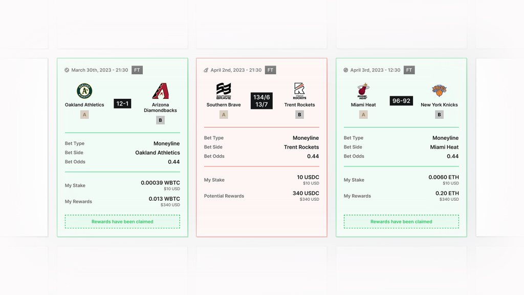
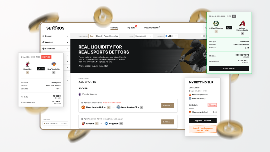
Visible regulatory credentials throughout the experience, not just in the footer. The Setoros project is a good example from our portfolio — a web3 sports betting platform designed to feel like a premium web2 product, with blockchain technology providing the infrastructure but not dominating the user-facing experience.
Designing for Different User Types
A prediction market’s audience is not monolithic. The interface must flex for at least three distinct personas while maintaining consistency and trust.
The Casual Participant
This user discovered prediction markets through social media or a news article. They may have never traded anything before. They want to express an opinion on an event they care about and potentially make money doing so.
Design for this user means: simplified market cards with natural language descriptions, binary Yes/No choices with clear payout explanations (“You pay $0.30. If correct, you get $1.00”), minimal steps to first trade, and prominent “how it works” contextual education that appears alongside the action rather than in a separate tutorial.
This is also the user most likely to be retained by gamification mechanics. A first-trade celebration animation, a “+50 XP” notification after their initial prediction, a prompt to “set a daily reminder to check your positions” — these are the micro-moments that convert a one-time curious visitor into a returning user. Without them, the casual participant places one trade, forgets about the platform, and never returns until the next major news event drives them back from social media.
The Active Trader
This user trades regularly across multiple markets, holds several open positions, and monitors probability movements as part of their decision-making process. They want data density, fast execution, and portfolio-level tools.
Design for this user means: full order book access, depth charts, probability timeline charts with configurable timeframes, portfolio dashboards showing positions across markets, P&L tracking, and keyboard shortcuts for rapid trade execution on desktop. This user does not want to be shielded from complexity — they want tools that match their sophistication.
The Institutional or Analytical User
This user may represent a hedge fund, a media organisation using prediction market data for reporting, or a researcher studying forecasting accuracy. They want data export, API access, historical accuracy metrics, and the ability to assess market quality (liquidity, spread, participant count).
Design for this user means: transparent market quality indicators, downloadable data, embeddable widgets, and documentation that supports integration rather than just participation.
Progressive disclosure is the mechanism that serves all three. The default experience serves the casual participant. One layer deeper serves the active trader. API documentation and data tools serve the institutional user. No single user is forced through an interface designed for someone else.
A Practical Design Workflow
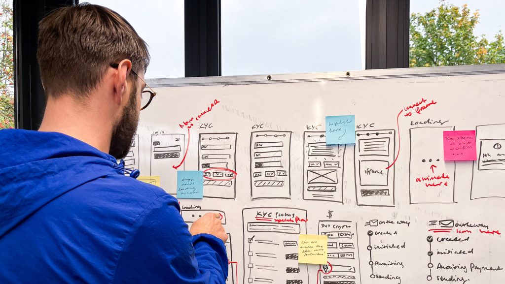
For teams building a prediction market from scratch, this is the design workflow we recommend based on our experience shipping blockchain products:
Phase 1: Discovery and competitive analysis (1-2 weeks). Map the complete user journey from awareness to first trade to repeat engagement. Audit Polymarket, Kalshi, and Robinhood against your target audience. Identify which patterns to adopt, which to adapt, and which to reject. Define your position on the key spectrum: consumer simplicity ↔ trader depth.
This is the phase we run as a consultancy engagement — a structured sprint that produces a clear specification, information architecture, and design direction before any UI work begins.
Phase 2: Information architecture and user flows (1-2 weeks). Define the market taxonomy (how categories are organised), the market page hierarchy (what information appears in what order), and the complete onboarding funnel with each verification tier. Map every transaction state: pending, confirmed, failed, expired, settled, disputed. These flows are the skeleton of the product and must be right before visual design begins.
Phase 3: Wireframing and low-fidelity prototyping (2-3 weeks). Prototype the core screens: market discovery, market detail page, trade placement, portfolio view, onboarding/KYC, and settlement/payout. Test with representative users at this stage — the cost of discovering an information architecture problem in wireframes is orders of magnitude lower than discovering it in production.
Phase 4: Visual design and design system (3-4 weeks). Develop the high-fidelity UI, component library, and design system documentation. This should include: the probability display system (chart types, colour coding, animation language), the market card component at all viewport sizes, the trade placement module, error and success state patterns, and the compliance UI components (risk disclosures, geo-gates, KYC steps).
Phase 5: Interactive prototyping and usability testing (1-2 weeks). Build a clickable prototype of the critical paths and test with real users. Focus testing on: can users understand probability from the market card alone? Can they place a trade in under 30 seconds? Do they trust the platform enough to deposit money? Do they understand what happens when a market resolves?

Phase 6: Design-engineering handoff and iteration (ongoing). Using a tool like Figma with a dedicated “Ready for Development” section ensures engineers can begin implementation as designs are approved, rather than waiting for a complete handoff. Post-launch, analytics-driven iteration refines every element based on real user behaviour data.
A Note on Accessibility
Prediction market platforms should meet baseline accessibility requirements: full keyboard navigation for all trading actions, screen reader compatibility for probability displays, colour-independent status indicators (using shape or directional arrows alongside colour, not just red/green), and appropriately sized touch targets on mobile. These are not optional — they broaden the addressable market and, in many jurisdictions, are legal requirements. Build them into the design system from the start rather than retrofitting later.
Continuous Improvement: What to Measure
Launching is the beginning of the design process, not the end. The prediction markets that win in 2026 are those that iterate fastest based on real user data.
Key metrics to track include: first-trade conversion rate (what percentage of visitors place a trade), time-to-first-trade (how many seconds from landing to trade confirmation), market discovery depth (how many markets a user browses before trading), onboarding funnel drop-off (where users abandon the KYC/deposit process), mobile vs desktop behaviour differences, and repeat engagement rate (what percentage return within 7 days).
Tools like Hotjar (heatmaps, session recordings), Mixpanel (event-based analytics, funnel analysis), and standard web analytics should be configured from day one. A/B testing should focus on the highest-impact elements first: market card design, trade placement flow, and onboarding steps.
The improvement loop is: instrument → observe → hypothesise → test → ship → repeat. Teams that run this loop weekly will outperform those that redesign quarterly.
Frequently Asked Questions
How can UX/UI design reduce cognitive load in prediction markets?
The most effective approaches are probability display in dual formats (cent price alongside percentage), progressive disclosure that shows only the information relevant to the user’s current task, contextual micro-explanations that define terms at the point of need rather than in a separate glossary, and a card-based market discovery pattern that standardises how every market is presented so users learn to read the format once. Reducing the steps to understand “what is this event, what are the odds, and how do I participate” to a single glance at a market card is the benchmark for low cognitive load.
What role does personalisation play in modern prediction market interfaces?
Personalisation in prediction markets currently operates at two levels. The first is content personalisation — surfacing markets relevant to a user’s demonstrated interests (sports, politics, crypto) and filtering categories based on past browsing and trading behaviour. The second is interface personalisation — adapting information density based on user sophistication, showing simplified views for new users and progressively unlocking advanced tools as engagement deepens. Both approaches can meaningfully improve engagement and conversion when implemented with proper consent and transparency about how personalisation decisions are made.
How should designers accommodate novice and professional traders differently?
Through progressive disclosure and role-aware defaults. Novice traders should see a simplified interface: event description, probability as a percentage, binary Yes/No choice, clear payout explanation, and a single action button. Professional traders should have access to full order books, depth charts, configurable probability timelines, portfolio analytics, and keyboard shortcuts. The key is that these are layers of the same product, not separate products — a novice who becomes more sophisticated should organically discover advanced features rather than hitting a wall and needing to switch to a different interface.
What accessibility features should prediction market platforms include?
At minimum: full keyboard navigation, screen reader compatibility for probability values, colour-independent status indicators, and appropriately sized touch targets. Build these into the design system from day one rather than retrofitting after launch.
How can gamification and XP systems improve prediction market retention?
Prediction markets suffer from event-driven boom-bust engagement — users arrive for big events and disappear between them. XP systems that reward daily logins, accurate predictions, social sharing, and streak maintenance create reasons to return independent of the event calendar. The key is rewarding participation and accuracy rather than trading volume, and tying XP to real-world rewards (discounts, merchandise, premium features) rather than abstract points. Micro-interactions — satisfying trade confirmation animations, XP gain notifications, streak progress indicators — amplify the effect by making every interaction feel rewarding at a tactile level.
How can analytics improve prediction market UX over time?
By instrumenting every step of the user journey from first visit through repeat engagement, then running continuous improvement cycles. The highest-impact areas for analytics-driven optimisation are typically: the onboarding funnel (where exactly do users drop off during KYC or deposit?), the first-trade flow (what prevents users from completing their first trade?), and the market discovery experience (which market categories and card designs drive the most engagement?). Heatmaps reveal where users look and click, session recordings show where confusion occurs, and funnel analysis quantifies the impact of each friction point. Teams that measure weekly and ship improvements biweekly consistently outperform those that redesign based on assumptions.
Next Steps
If you are planning or building a prediction market, the design decisions you make in the first 12 weeks will determine the trajectory of your product. The patterns in this guide — drawn from the three leading platforms and our experience across 100+ blockchain product launches — provide a framework, but every product needs design decisions tailored to its specific audience, regulatory environment, and competitive positioning.
We run structured discovery and consultancy engagements for exactly this purpose: a focused sprint that produces a clear information architecture, validated user flows, and a design specification before any UI production begins. If you are at the stage of defining your prediction market’s UX strategy, start a conversation with us.
Related Reading
- Blockchain UX Design Guide — The Complete Guide to UX in Web3
- Case Study: Lingo Islands — Launching the Biggest SocialFi Campaign Ever
- Case Study: Transak — Onboarding a Generation to Crypto
- Case Study: Linea — Building a Reward Hub for Consensys
- Case Study: Setoros — Web3 Sports Betting with Web2 Feel
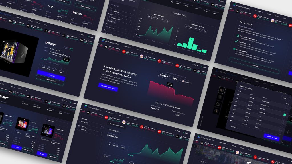
- Case Study: Evaluate Market — NFT Analytics and Trust
- Product Design Services
- Consultancy Services