A More Liquid Commodity
The launch of Ocean V3 at the end of October 2020 saw the introduction of a BETA version of The Ocean Marketplace.
Ocean Marketplace was made possible by the Data token at the heart of the V3 update. The ERC20 Data token represents the value of the data asset and also provides access control in a decentralised manner.

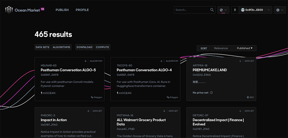
Ocean’s aim is to create a marketplace for data that is as accessible to as many users as possible by simplifying the user interface and adopting existing familiar models for custody, wallets, liquidity, staking and farming. Whilst still in BETA; these features are now live for the community to explore and participate in the genesis of this exciting development.
We’ve highlighted 8 of the best UX features in the marketplace and have even added in some of our improvements – so let’s take a look . . .
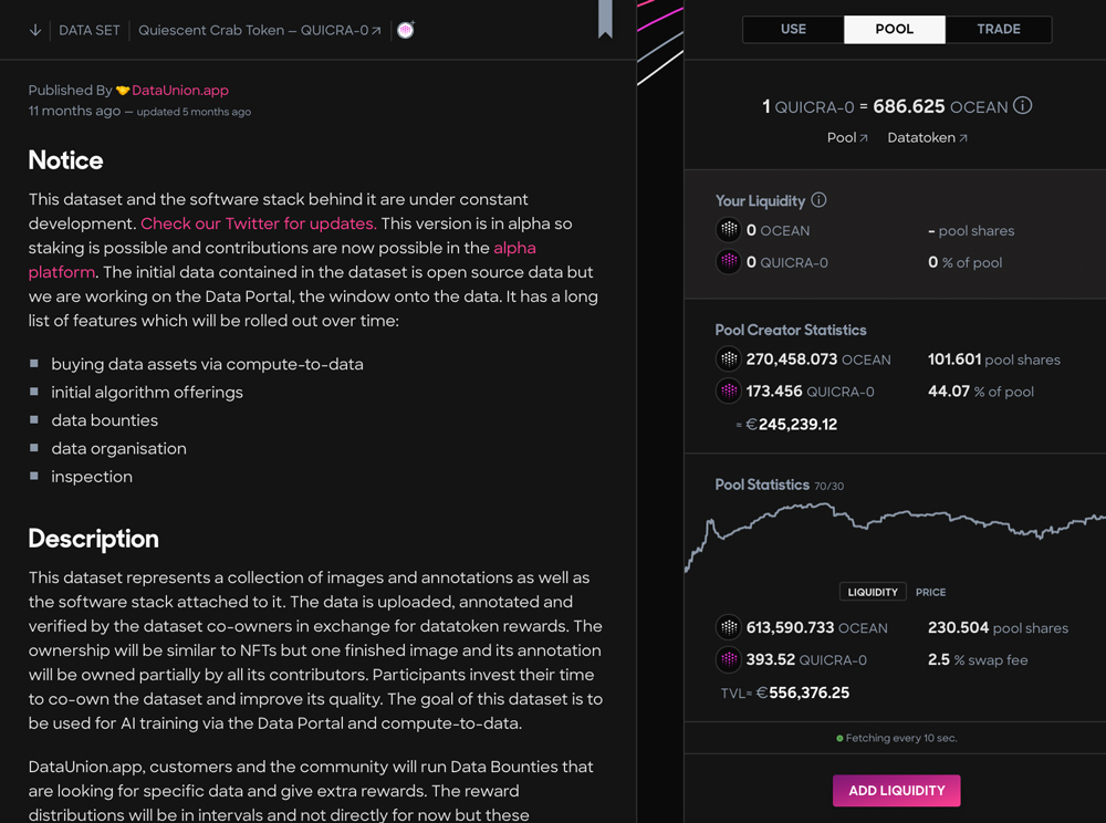
1. Pool Stats
The addition of the Pool Stats not long after launch was a welcome touch, giving the user some perspective before staking their precious OCEAN.
The graph includes a toggle option allowing users to switch between looking at the price of tokens and the total liquidity in a given pool.

2. Removing Liquidity
One improvement we’d like to see here though is the ability to see your original stake and return as separate values when removing liquidity. Currently, the user only sees the combined total and this can make it difficult to calculate any returns in any pools the user has staked in.
Users staking in several different pools may not remember the initial amount of OCEAN that they invested in each pool.
3. Bookmarking Datasets
One feature which can be very valuable for new and existing users is the ability to bookmark datasets. This allows you to watch the progress of a dataset and its liquidity over time without having to part with any of your OCEAN. This is especially useful for users who are still getting to grips with the platform.
This can be quite easily missed at first glance, however, if you look on the right-hand side of datasets you will see a small bookmark icon. One small improvement we’d like to see here is for this feature to be a bit more prominent in the design.

4. Data Publisher Profiles
It’s important to pay close attention to the credibility of the data publisher. The Ocean team has added some valuable UX features to protect OCEAN holders looking to add liquidity to pools.
Next to the Data Publisher’s name, you will see a small tooltip labelled ‘Profile’. Hovering over this will give you some helpful insight about the publisher including any social media links, website addresses and even GitHub repos in some instances.
This can be valuable when trying to establish the authenticity of a data publisher. However, you should still use your OCEAN with caution, even when a project looks like it has a strong team behind it.
A stark reminder of this came on 13th of November when the CivicTechHub pool had a large amount of its liquidity pulled by its founder.
Last night @CivicTechHub removed their entire stake of 9,900 $OCEAN from CERTUR-1 on the Ocean Market after making a 9x gain on their initial stake of 1,000 $OCEAN. While the actual amount was not large, it shook the community confidence.
— Bruce Pon (@BrucePon) November 13, 2020
CivicTechHub were an official ‘Data Launch Partner’ and were announced on the official Twitter account.
The event sent shockwaves through the community as the Civic pool had been much anticipated due to its status as an Ocean approved partner. The datasets provided by approved partners were popular with the community, as it was presumed that they would attract value and remain stable with less of the volatility found in other pools.
In credit to the Ocean team, they responded very quickly to the event with full transparency.
Founder Bruce Pon posted a series of tweets explaining what had happened and how they would work to exclude ‘bad actors’ going forward. But, after the ups and downs of a few weeks testing the marketplace, it was this tweet that ring true:
We reiterate, Ocean Market is in beta. You should not be injecting meaningful sums into datasets until you fully understand the risks of losing your $OCEAN. Use the market with EXTREME caution as you can lose all of the money you inject.
— Bruce Pon (@BrucePon) November 13, 2020
The Ocean team has been working on UX improvements to stop rug pulls such as this.
5. Default Weight Changes
For the creation of any new pools Ocean has changed the default weight to 70% OCEAN & 30% data token.
This helps to mitigate rug pulls and better aligns the incentives of publishers and liquidity providers.
6. Flagging Pools and Publishers
Another helpful UX addition to the marketplace is that violations are now flagged with clear and consistent warning messages. Users are also prevented from adding more liquidity to these pools.
7. Input Fields
The Ocean Marketplace also allows you to publish your datasets and become a ‘Data Publisher’.
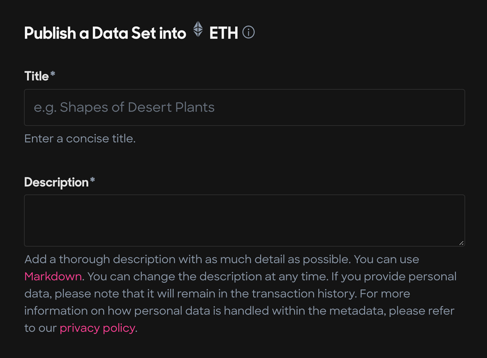
One of the things we noticed when looking at the publish area of the marketplace was that some input fields, such as the description field required some knowledge of markdown to format the text. This could mean some users who don’t have a technical background may have to spend a lot more time formatting text.

This could be fixed with a simple WYSIWYG, allowing non-technical users to publish datasets. We’ve put together a little mock-up of what this could look like in the Ocean Marketplace.
8. Validation Messages
Another small issue we came across was around validation messages when publishing data. The messages are often very unclear to the user, with no option to explore what the actual error message means. An example of this can be seen below; when testing this marketplace we were presented with the error ‘Published DDO failed’.
This could be fixed with either the use of tool tips that explain what the outputted error messages mean or just a simple line of text under the error message.
The Verdict
The marketplace may still be in BETA but the team at Ocean have succeeded in their aim of making the user interface simple and as familiar as other popular apps.
However, one addition we’d love to see is an area in the marketplace where you can view a dashboard that displays some key metrics of how the pools you’ve staked in have performed.
Currently, users who have staked in several different pools will find it quite difficult to get a clear overall picture.
We’ve thrown together a little design of how this might look:
As mentioned, Market Place is still in BETA and it should be treated as such. In its initial weeks, we found the pools to be quite volatile. New pools were attracting a lot of liquidity and the OCEAN value of your stake in the pool would increase. If you withdrew your liquidity at that point you might have gained a substantial amount of OCEAN in comparison to your initial stake.
That aside, we look forward to watching the marketplace evolve throughout the BETA phase of its development. You can keep up to date with all Market Place developments on the dedicated Ocean Market Updates Twitter account.
We approached Ocean Co-Founder, Bruce Pon to ask for his thoughts on the progress of the marketplace so far:
Ocean Market gives people a way to sell data using leading-edge web3 technology. We’re going to improve the dynamics and onboarding throughout 2021.
Bruce Pon | Co-Founder of Ocean Protocol
Oceans decision to release the Market Place in BETA for anyone to test was bold and has at times provided an insight into how they deal with sticky situations. It has also demonstrated its methodical attitude to building its product, adopting a community-focused, transparent approach. An approach that the users of any future top 10 project will relish and indeed come to expect. It would seem that what we have seen so far from Ocean Protocol may just be a drop in the proverbial, in comparison to the project’s potential in 2021 and beyond. All aboard!

